2025 | Custom Website
The Upstream Collective.
Who is The Upstream Collective?
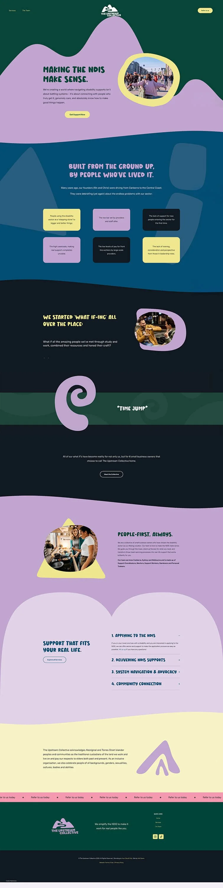
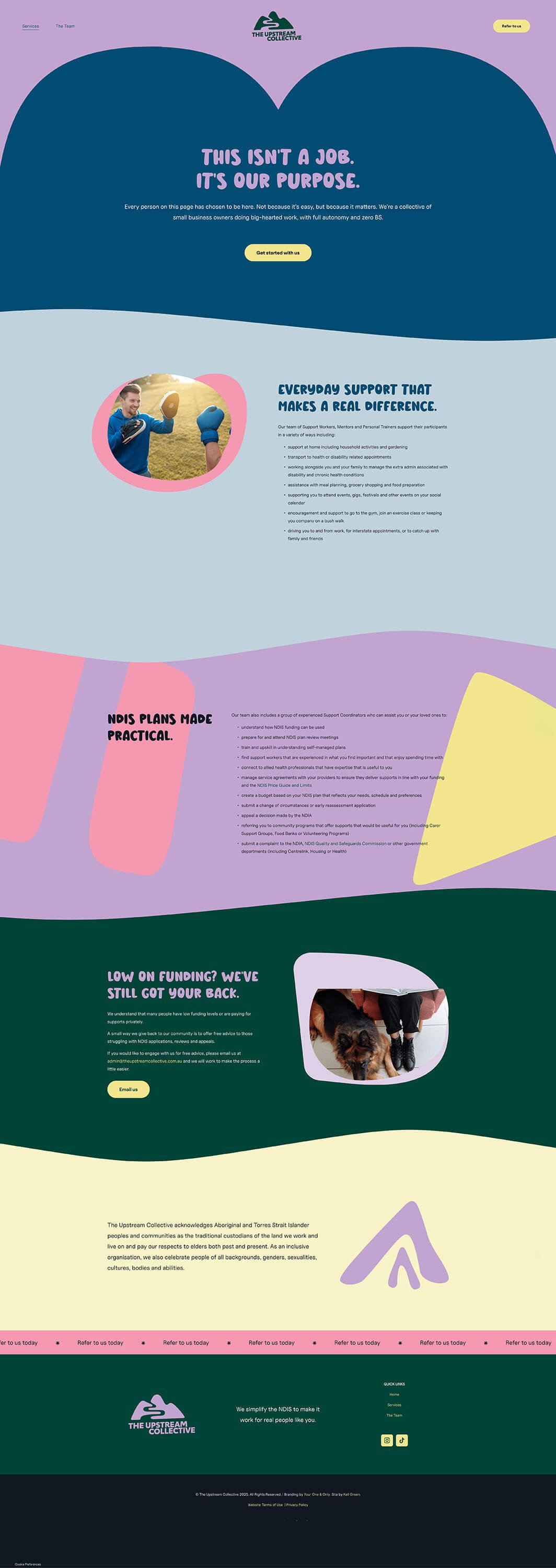
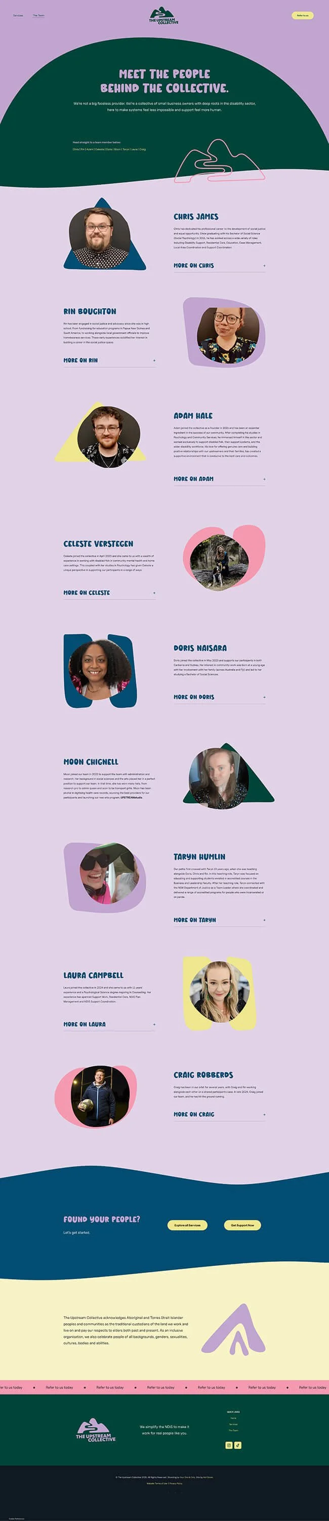
The Upstream Collective exists to make the NDIS make sense. For families and individuals navigating disability supports, they're the people who genuinely get it, truly care, and know how to make good things happen. 💜
The brief.
After completing a full rebrand (including new visuals from Your One and Only), The Upstream Collective then needed to redesign their previous website from the ground up.
New copy. New look. Same mission: make sure every touchpoint is as simplified and clear as possible.
The work.
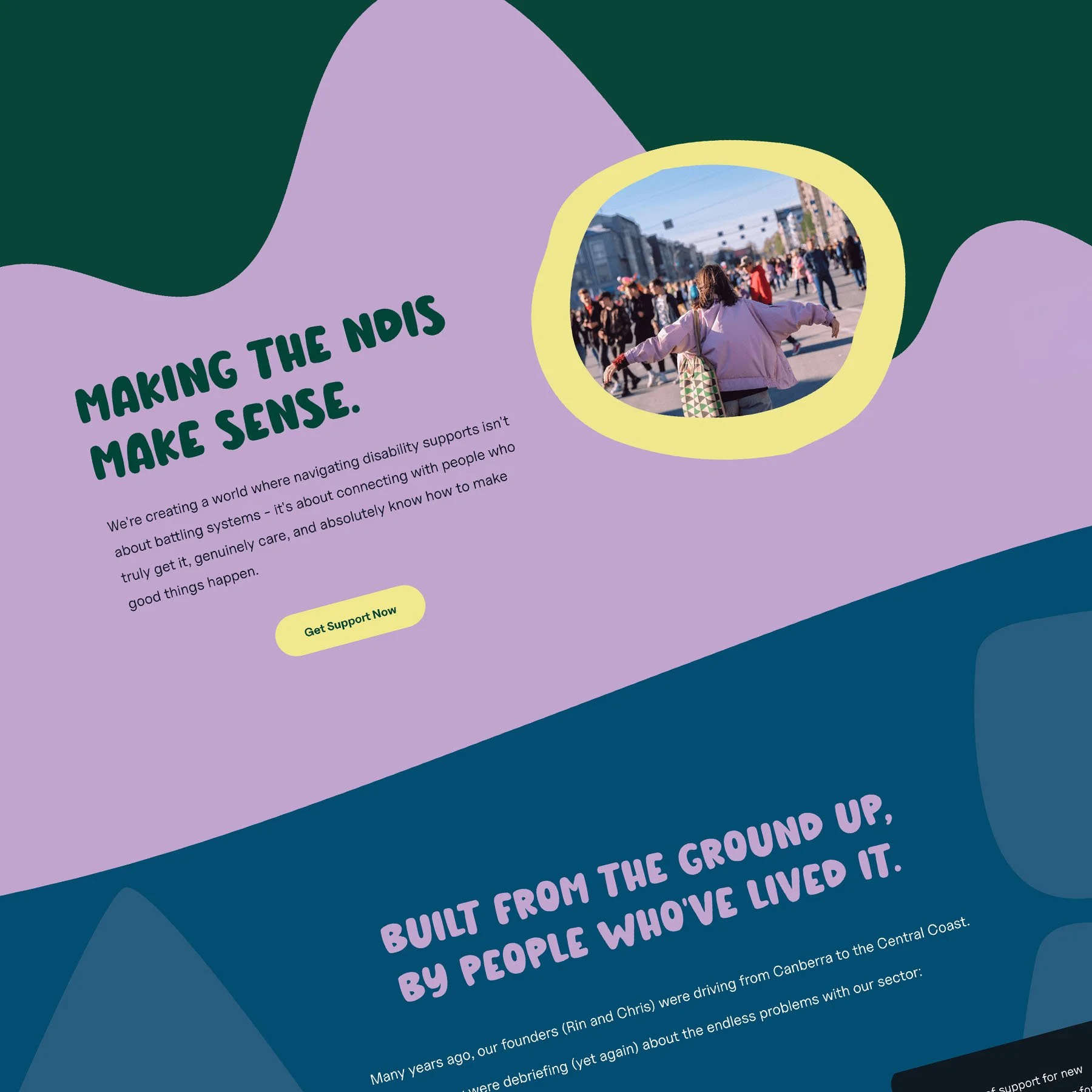
With new visual assets and guidelines created by Tara from YO&O, this box was ticked and hugely assisted in shaping the look of the new site.
But before the build could begin, Rin’s first task was auditing what was staying from The Upstream Collective 1.0 and what was outdated. She thoroughly cleaned house when it came to what moved to their 2.0 website, making sure nothing irrelevant was still being presented to visitors, and rewrote the majority of copy for their new website.
She also gathered a library of photos for me to use and I am not exaggerating when I say this is such a huge help to web designers. We learn as much as we can about your business before and during the build, but *you* are the expert on your brand. Doing this step eliminates the guesswork on our part in what will suit best (not to mention limiting revisions and extending the time before launching your site)!
Onto the build. The previous website was hosted and built on Wordpress. Was I excited to bring Upstream over to the Squarespace side for easy, stress-free updates forever? You bet I was. 😉
With a business that exists to help people navigate the NDIS, my top priority was to ensure site visitors could navigate their website with ease. Correct HTML hierarchy, alt text, custom file names, colour contrast and an accessibility plugin (in this project, from UserWay) were non-negotiables for this website.
That’s not to say I couldn’t have fun with some extra CSS animations though! Brand shapes placed behind images all have a slight wobble, that adds to the experience rather than distracts. But by far my favourite part of this website? Animating the ‘swirl’ motif to spin as you scroll past text that says time jump. It’s 100% relevant to the content, quirky and quite frankly, bloody adorable.
The outcome.
I really enjoyed how much this website proved accessibility and personality can more than just co-exist, they complement each other perfectly.